Design Work: A Case Study
I started this website, Eclogiselle, and already had a good idea of which Blogspot template I wanted to use, but I wasn't sure what color scheme I wanted or other details. I didn't document the process, so I don't have a bunch of screenshots.
The below image is the "final" product of the landing page. In other words, it's the current landing page as of this writing.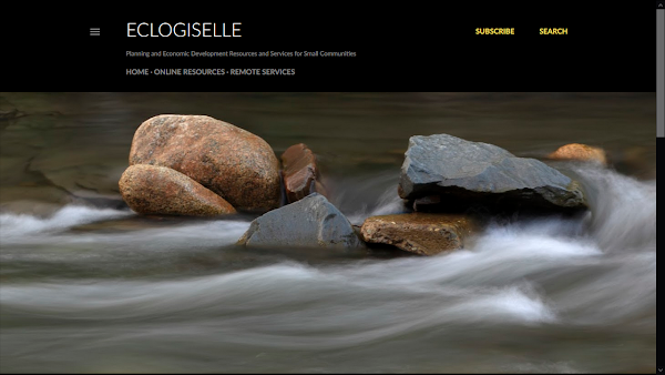 In a nutshell, I picked a template and tried out multiple different stock images for the landing page until I found something I liked. An unexpected side effect of going with the calm image of rocks in a river is that the algorithm for the template changed the accent color to a fairly bright yellow instead of the beige I was expecting.
I decided I am okay with that, but I have made a mental note that I need to be mindful of the strong yellow accent. Yellow is fine as an accent color in small amounts, but can be a problem in large quantities. One mental note I made is that I should try to include images or videos in most posts so I don't have a wall of bright yellow squares on the landing page below the featured post.
This site is still under development and isn't being announced yet to the general public and I am still making tweaks. In the process of writing this post, I decided I needed to add a border to images so you could tell where the black screenshots ended and the black webpage began.
That doesn't seem to have impacted the Featured Post view on the landing page. This screenshot (below) was taken before I added CSS to the Blogspot template to add an image border and it remains how this featured post still looks on the landing page after adding the border: I googled a few things and tried a few things. Ultimately, I found this page about How To Add a Border to an Image and copied and pasted their example code, then played with it. I shrank 5px gradually to 1px, trying a few other sizes in between.
That kind of repetition is the norm when I do design work. I assume it's pretty much the norm for everyone.
Here are the two screenshots I made of the page view of the Featured Post about the Service Area, both before and after adding the CSS to give images a tiny border:
 I'm taking my time to think things through and do things right before promoting this site. The service area page took a few days to pull together and this post is one I have been thinking about for a few days before sitting down to write.
I went through a few versions of the map on the service page before settling on one I liked. Here are the many different things I tried before settling on the map in question (some of these images are "works in progress"):


 Here are the screenshots I was editing to try to get something I liked:

 When I went to set up r/CoastalWA, I used a portion of the map from the Service Area page and went through a similar iterative process. In fact, the above maps that have teal ocean water grew out of me trying to design r/CoastalWA and wondering if I could improve on what I had here as well.
Ultimately, this site ended up with a black, white and yellow map to go with the black, white and yellow design here and r/CoastalWA ended up with some gold and beige tones with black accents to make the map work there. Reddit is its own design environment and getting boths sites to play nicely with the same map took some time.
Here are screenshots from the final product for r/CoastalWA and some of the different iterations of maps I went through in trying to find one that worked well for the icon over there:


 So it took many hours of work to just set this site up and get to having a "pinned" Service Area post with a good map and then create a coordinating reddit (r/CoastalWA) for the core service area. I didn't just whip any of it up in five minutes, though I have a fair amount of relevant education and experience.
I have a Certificate in Geographic Information Systems (GIS) from UC-Riverside. GIS is fancy map stuff, like the tech behind Google Maps, and UC-Riverside is one of the most respected GIS programs on the planet.
They are so good in part because they are so close to ESRI, the biggest name in GIS. Some of my professors worked full-time at ESRI and taught GIS part-time at UC-Riverside.
I also worked at Aflac for five years. Before my job officially started with them, I also went through three months of training, much of it on-site at Aflac and part of it on-site at a local technical college.
This is relevant because Alfac has a wholly-owned subsidiary called Communicorp that does all of its print work. They do award-winning work and I looked at and handled their products daily as part of doing my job.
This is actually one of the secrets to their sucess. "Wholly owned subsidiary" means Communicorp is an entirely separate business entity from Aflac, but Aflac owns them in whole. Aflac doesn't just have stocks in Communicorp or own a portion of the company.
So what that means is Aflac decided at some point that they did so much printing that they needed their own printing firm to service their needs and they created a separate print business that their insurance company owns outright. Communicorp does all of Aflac's printing, but also is for hire and serves other companies.
Seeing the design work done by Communicorp daily for over five years was a huge growth experience and really helped develop my eye for good design. I also have run my own websites for around twenty years and have done self-study courses to help me with that.
The maps on this page were developed using freely available materials under a Creative Commons license and can be used by other people with appropriate citation (such as the one below). If you want to hire me to do website work or maps, get in touch.
The below image is the "final" product of the landing page. In other words, it's the current landing page as of this writing.
Landing Page For This Site

I decided I am okay with that, but I have made a mental note that I need to be mindful of the strong yellow accent. Yellow is fine as an accent color in small amounts, but can be a problem in large quantities. One mental note I made is that I should try to include images or videos in most posts so I don't have a wall of bright yellow squares on the landing page below the featured post.
This site is still under development and isn't being announced yet to the general public and I am still making tweaks. In the process of writing this post, I decided I needed to add a border to images so you could tell where the black screenshots ended and the black webpage began.
That doesn't seem to have impacted the Featured Post view on the landing page. This screenshot (below) was taken before I added CSS to the Blogspot template to add an image border and it remains how this featured post still looks on the landing page after adding the border:
Featured Post (Permanently "Pinned")

That kind of repetition is the norm when I do design work. I assume it's pretty much the norm for everyone.
Here are the two screenshots I made of the page view of the Featured Post about the Service Area, both before and after adding the CSS to give images a tiny border:
Before

After

I went through a few versions of the map on the service page before settling on one I liked. Here are the many different things I tried before settling on the map in question (some of these images are "works in progress"):


Ultimately, this site ended up with a black, white and yellow map to go with the black, white and yellow design here and r/CoastalWA ended up with some gold and beige tones with black accents to make the map work there. Reddit is its own design environment and getting boths sites to play nicely with the same map took some time.
Here are screenshots from the final product for r/CoastalWA and some of the different iterations of maps I went through in trying to find one that worked well for the icon over there:


I have a Certificate in Geographic Information Systems (GIS) from UC-Riverside. GIS is fancy map stuff, like the tech behind Google Maps, and UC-Riverside is one of the most respected GIS programs on the planet.
They are so good in part because they are so close to ESRI, the biggest name in GIS. Some of my professors worked full-time at ESRI and taught GIS part-time at UC-Riverside.
I also worked at Aflac for five years. Before my job officially started with them, I also went through three months of training, much of it on-site at Aflac and part of it on-site at a local technical college.
This is relevant because Alfac has a wholly-owned subsidiary called Communicorp that does all of its print work. They do award-winning work and I looked at and handled their products daily as part of doing my job.
This is actually one of the secrets to their sucess. "Wholly owned subsidiary" means Communicorp is an entirely separate business entity from Aflac, but Aflac owns them in whole. Aflac doesn't just have stocks in Communicorp or own a portion of the company.
So what that means is Aflac decided at some point that they did so much printing that they needed their own printing firm to service their needs and they created a separate print business that their insurance company owns outright. Communicorp does all of Aflac's printing, but also is for hire and serves other companies.
Seeing the design work done by Communicorp daily for over five years was a huge growth experience and really helped develop my eye for good design. I also have run my own websites for around twenty years and have done self-study courses to help me with that.
The maps on this page were developed using freely available materials under a Creative Commons license and can be used by other people with appropriate citation (such as the one below). If you want to hire me to do website work or maps, get in touch.
The Maps on this page are by Stamen Design and are being used under CC BY 3.0. Map Data by OpenStreetMap, under ODbL. Maps have been edited by Doreen Traylor.